There are a few basic approaches that will help when designing any Graphical User Interface (GUI), such as those running on HMIs. As normal the design process begins with gathering information, providing a structure, and then implementing the structure. A good set of introductory questions are given below.
1. Who needs what information?
2. How do they expect to see it presented?
3. When does information need to be presented?
4. Do the operators have any special needs?
6. What choices should the operator have?
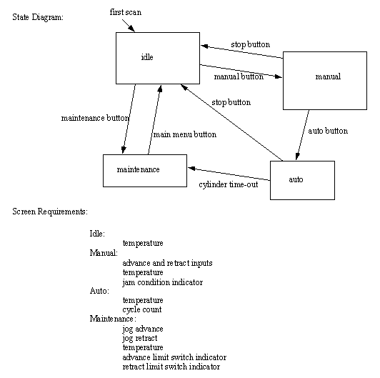
After this information gathering stage the HMI Functionality can be designed using a state diagram and a list of input/output requirements for each screen. A simple example is given in Figure 28.1 State Diagram for a Simple HMI. Each of the four states in the diagram will become one of four HMI screens. The transitions between the screens are normally touchscreen buttons, but could also be values set by the PLC. For each of the screens a requirements list must be developed that shows the important information and actions available to the user.

Figure 28.1 State Diagram for a Simple HMI
HMI design also requires a limited amount of artistic skill to increase usability. A few simple rules-of-thumb a good HMI design are given.
Common Look and Feel - each screen should look very similar.
Components with similar function should appear in the same place on each screen
Colors and logos should be consistent between screens
Use colors conservatively - especially green, red, and yellow
Provide helpful notes (or popup help)
Indicate the current state of operation clearly on each screen
buttons - change the shading or similar when pressed
Adjust the interface to the user
maintenance screen have more technical content
operator screens simpler language, task oriented
other languages for non-english speakers
icons instead of words for reduced literacy
A clear interface design can be presented to customers and non-technical people to get feedback before the implementation. These should include i) the State Diagram, ii) a list of Screen Requirements, and iii) a Look-and-Feel in general, and for each screen. Once these have been set the process of programming the HMI becomes a trivial matter.