|
|
|
|
|
|
|
|
3.1 CONTROL CHARTS
������������Basic plots of statistical variation to show trends. Uses basic values like,
- these give a measure of performance, and therefore we can estimate the benefits of process parameter adjustment.
3.1.1 Sampling
������������values used for control charts should be numerical, and express some desired quality.
selecting groups of parts for samples are commonly done 2 ways.
INSTANT-TIME METHOD - at predictable times pick consecutive samples from a machine. This tends to reduce sample variance, and is best used when looking for process setting problems.
PERIOD-OF-TIME METHOD - Samples are selected from parts so that they have not been presented consecutively. This is best used when looking at overall quality when the process has a great deal of variability.
Samples should be homogenous, from same machine, operator, etc. to avoid multi-modal distributions.
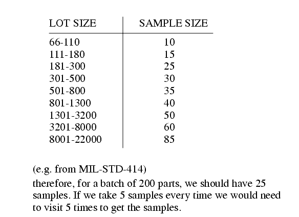
Suggest sample group size can be based on the size of the production batch
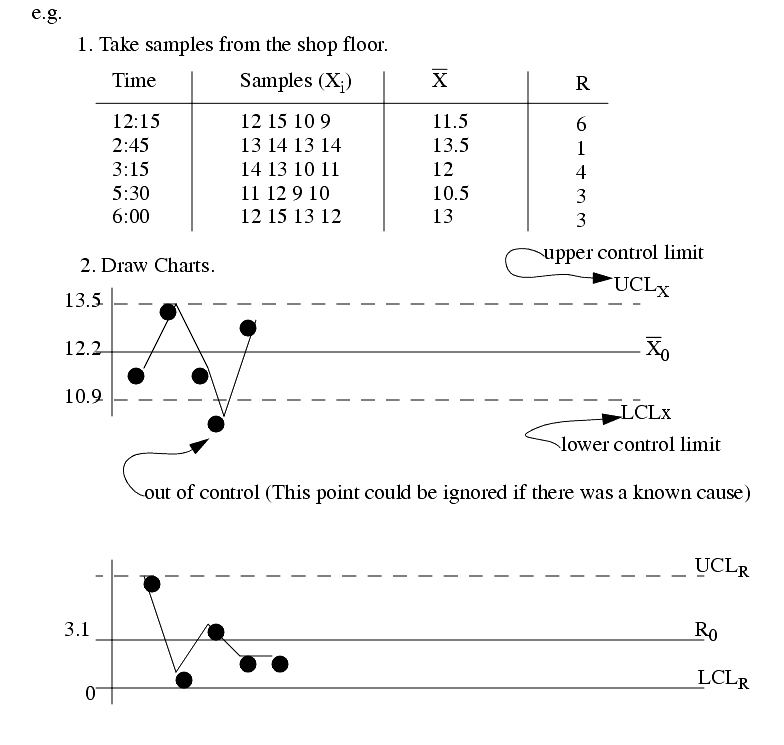
3.1.2 Creating the Charts
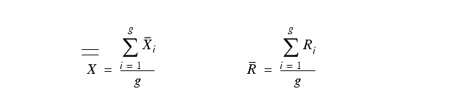
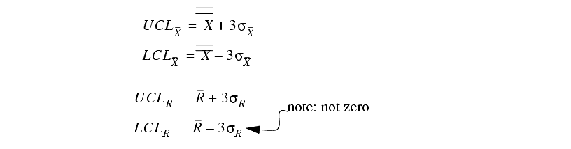
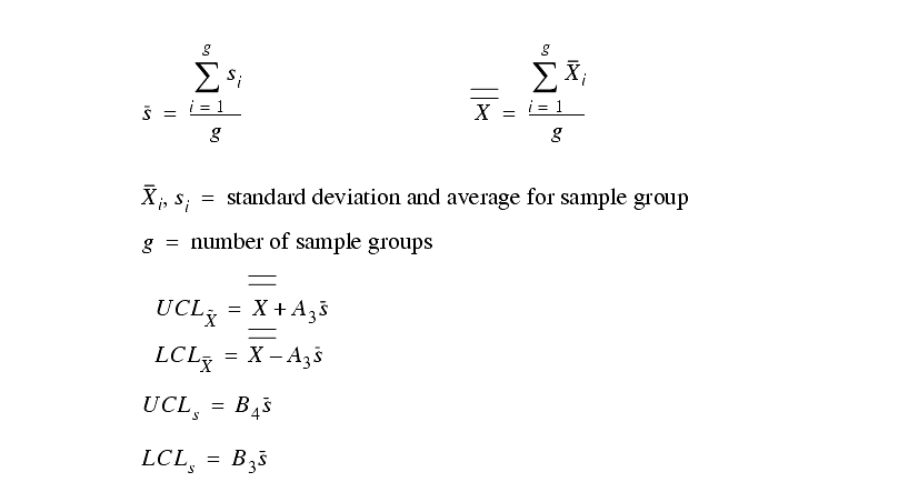
������������The central line is an average of `g' historical values.
The control limits are +/-3 s of the historical values
At start-up these values are not valid, but over time it is easy to develop a tight set of values.
For the non-technical operators there are a couple of techniques used.
3.1.3 Maintaining the Charts
������������Over time sR and sX should decrease.
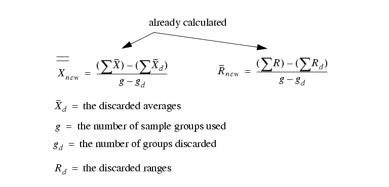
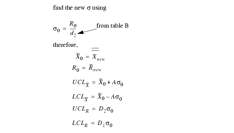
If some known problems occurred that created out of control points, we can often eliminate them from the data and recreate the chart for more accurate control limits.
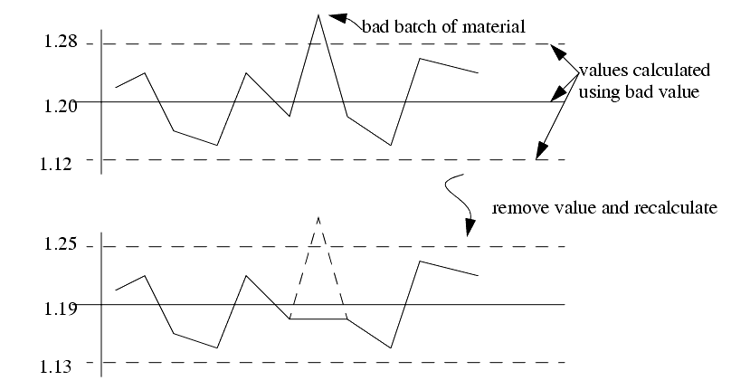
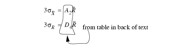
If we recalculate values from the beginning there is no problem, but if we are using the numerical approximation (using constants from table B)
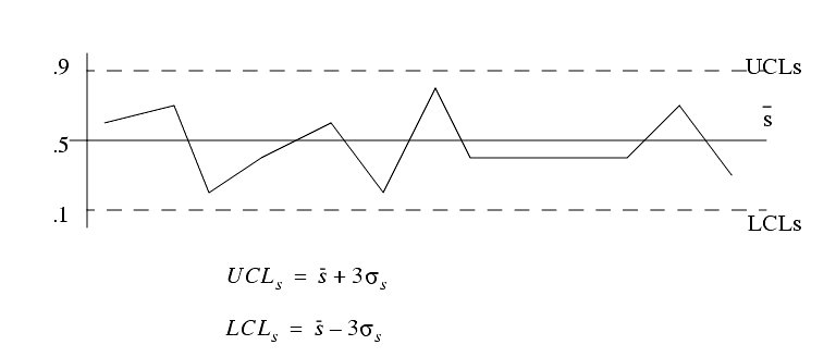
3.1.4 The s-Chart
������������Instead of an R-chart we can use an s-chart to measure variance
This chart will reduce the effect of extreme values that will occur with R charts. And, as the number of samples grows, so does the chance of extreme values to throw off the R-chart.
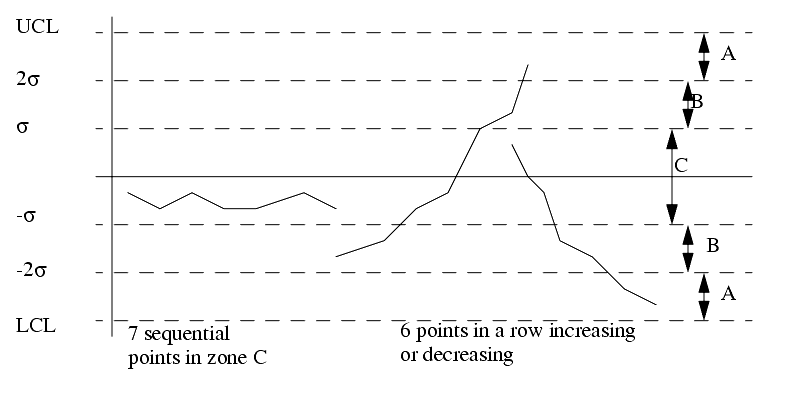
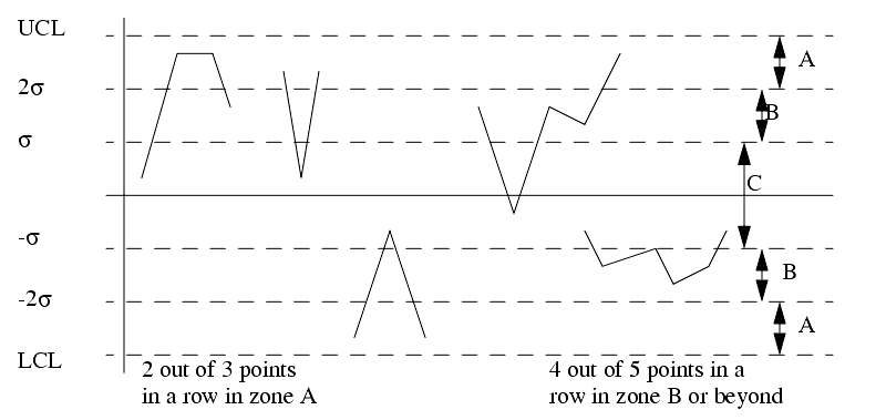
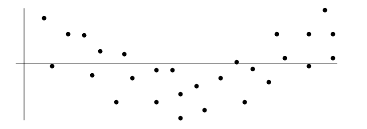
3.1.5 Interpreting the Control Charts
������������We consider a point that lies outside of the 3s control limits to be very unlikely, therefore the process is `out of control'
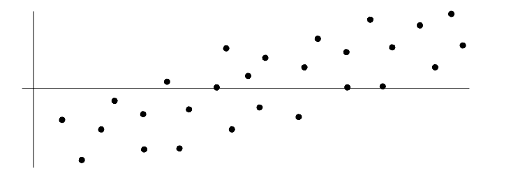
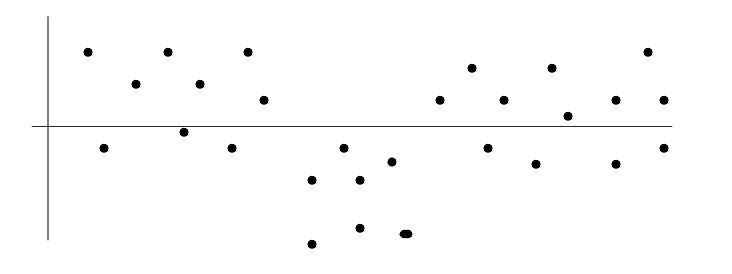
In some cases a process may have points within the control limits, but in highly unlikely trends that indicate a process is out of control
3.1.6 Using the Charts for Process Control
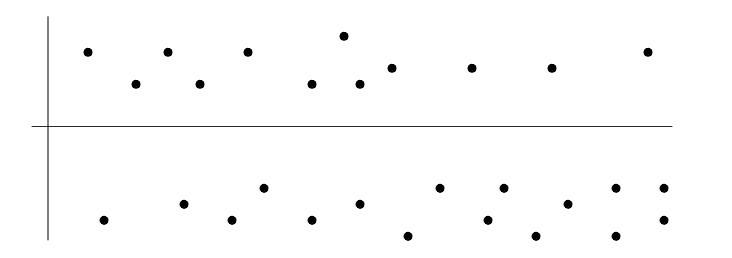
������������1. change or jump in level (X)
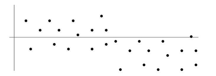
2. Change or jump in level (R)
3. trend, or steady change in level (X and R)
3.1.7 Practice Problems
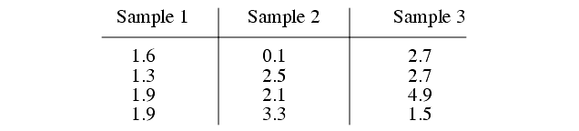
������������#1 Draw the detailed X, R, and s charts for the data below.
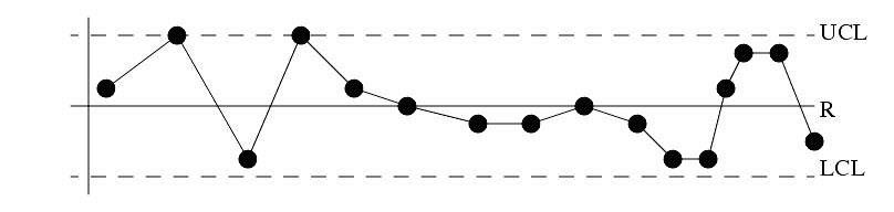
#2 What problems can be seen in this control chart?
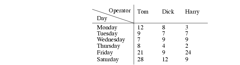
#3. Draw the Pareto diagram for the data below. The data indicates the number of reported errors made when taking fast food orders by telephone
Search for More: |

Custom Search
|
|